Showing posts with label colour. Show all posts

Friday, March 04, 2011

Rooms in Green

Do you know what a green room is?  No - it is not a room simply designed with green wallpaper or a green carpet, with a sofa in green and with green cushions. No - a green room has an entirely different meaning:

"In British English and American English show business lexicon, the green room is that space in a theatre, a studio, or a similar venue, which accommodates performers or speakers not yet required on stage. The green room functions as a waiting room, or as a touch-up lounge so that a performer need not return to wardrobe or to the dressing room, while remaining immediately available for a call to the stage. The origin of the term is often attributed to such an area historically being painted green, yet the modern "green room" is often not green at all.The specific origin of the term is lost to history, which has led to many imaginative theories and claims. One story is that London's Blackfriars Theatre (1599) included a room behind the scenes; this room happened to be painted green; here the actors waited to go on stage; and it was called "the green room." Some English theatres contained several green rooms, each ranked according to the status and the salary of the actor: one could be fined for using a green room above one's station


In addition to the preceding explanations, the term green room has also been attributed to numerous alternative folk etymologies, including the following" (I picked only a few which I found to be especially funny) (from Wikipedia):
  • Many actors experience nervous anxiety before a performance and one of the symptoms of nervousness is nausea. As a person who feels neauseous is often said to look "green", so the "Green Room" is the place where the nervous actors wait...
  • Some studies state that the green room was originally called the retaining room. The ensemble of a production would wait there for their appearance onstage, listening to the performance of the principal actors and critiquing their acting. When made aware of this practice, the leads began to call the retaining room the green room, mocking the (green) envy of these actors.
  • According to one theory, long before modern makeup was invented the actors had to apply makeup before a show and allow it to set up or cure before performing. Until the makeup was cured, it was green and people were advised to sit quietly in the green room until such time as the makeup was stable enough for performing. Uncured makeup is gone, but the green room lives on.
  • In Shakespearean theatre actors would prepare for their performances in a room filled with plants and shrubs. It was believed that the moisture in the topiary was beneficial to the actors' voices. Thus the green room may refer to the green plants in this stage preparation area.
  • In English theatres, a green floor-cloth was traditionally spread on the stage for tragedies. During the Restoration, when virtually all performances were comedies, the green floor-cloth for tragedies was stored in the actors' waiting room and used to deaden their footsteps so the sound of pacing actors would not disturb the performance. As tragedies were rarely performed, the green floor cloth became a routine fixture of the actors' lounge and the room became known as the green room.
  • In some theatre companies, the term green room also refers to the director's critique session held after a rehearsal or performance, since it is often held in the green room. This session is used for a pep talk, bonding among actors, and/or warmup exercises.
  • Green room is also a term for a room where plants are grown as the windows are made of glass, making it a perfect habitat for plants.
  • In the White House, the Green Room is one of three state parlors located on the state floor, it is traditionally decorated in green. (from Wikipedia)
But there are of course also green rooms which ARE designed in green shades and hues. Amazingly quite a lot of them although there hasn't been a single green hue nominated by Pantone since 2000 as colour of the year.

The choices from the fashion reports were different. There you could find a "vibrant green" and "kelp", the latter being rather a "khaki" green in the spring report of 2005. In the spring report of 2006 there was a "lily green" in their palette, in the fall report of 2007 appeared 2 green hues again: a "shale green" and a "green moss". In the spring report of 2008 appeared a "golden olive" and a "daiquiri green". In the fall report of 2008 Pantone said about "glady shade" that it delivererd a "natural elegance to the fall palette. Taking green in an interesting direction with its true green characteristics, this hue is a departure from greens of seasons past, which have had distinctively yellow undertones." In 2009 we suddenly had 3 green hues: "lucite green", "dark citron" and "vibrant green" again. This year's green hues are "peapod" for spring and "cedar" for fall.

So these are a lot of green hues for fashion. And there are a lot for room decorating which was really a surprise for me as I thought that green is not really a very common colour for interior design. But I was wrong.
The various examples of interior design with green are not meant completely serious - so please consider this collection with a little tongue-in-cheek...


(images are from: housebeautiful.com, apartmenttherapy.com, thefrencheye.blogspot.com, elizabethannedesigns.com, mahamudra.org.nz, chameleon-interiors.blogspot.com, bbonline.com, tobifairley.com, decoratingideakidrooms.com, thecornerhouse.co.za, soundandmotion.co.za, schusslerhouse.com, aliciabdesigns.blogspot.com, ffffound.com, hotels-paris-rive-gauche.com, niroproperties.com, simplifiedbee.blogspot.com, home-designing.com, mellonauditorium.com, marthastewart.com, stjohnshouse.com, theglamlamb.blogspot.com, eco-res.com, arhdecor.com, shelterness.com, tripadvisor.ie, decorinspiration.wordpress.com, fashionableinteriors.blogspot.com, alkemie.blogspot.com, couplanddancehall.com, blog.promove.com, housetohome.co.uk, travel.webshots.com, rosso-ubarri.com, maisondecor8.blogspot.com)

~

Sunday, February 27, 2011

What is Green?

I know - I am far behind my posts again. But I have some excuses. As I did not want to throw in just some meaningless words I need to find some time in between my other work to do some research and write about some things which might be of interest for you.


I want to continue with the series about the colour green. Let's go a bit into technical details i.e. into the rules of mixing colour and how the human vision works:

"Allegedly the physical world is achromatic. The human being can perceive light of various lengths between 400 and 700 nanometers as colours.Within the retina of the human eye there are colour sensitive photoreceptors in 3 different types. They are sensitive to 3 different wavelengths of the light, i.e. for short-wave, middle-wave and long-wave light. Short-wave light we see as blue, middle-wave light as green and long-wave light as red.

If the light is composed from two different wavelengths we will see cyan if the combination consists of short-wave and middle-wave light, yellow if we see a combination of middle-wave and long-wave light and magenta when the light is a mixture of long-wave and short-wave light. We will see white when all three wave-lengths are combined in equal parts and intensity. If no electromagnetic waves of the colour spectrum strikes the photoreceptors of the human eye (no light) we will see black.
This means the human eye has a maximum of 8 different extreme colour perceptions. They are the cornerstones and are therefore called the elementary colours."
(translated from http://www.ipsi.fraunhofer.de/~crueger/farbe/farb-wahr.html)
Red, yellow and blue make up the primary colours in a painter's colour wheel. This system, RYB is used in art and art related areas and was the prequel of the modern scientific colour theory.
But painters have always used more than the 3 primary colours and used green as the fourth primary although it is mixed from yellow and blue. Why is this so?

There are 2 major principles for mixing colours: additive mixing of colours and subtractive mixing of colours.When you use additive mixing you normally use light for mixing colours which are red, green and blue. When no colours are showing the result is black - when all colours are used the result would be white. Red and green create yellow, red and blue would turn into magenta. Additive mixing of colours is used in television and computer monitors.


The second principle of mixing colours is called subtractive mixing.
"Subtractive mixing is done by selectively removing certain colors, for instance with optical filters. The three primary colors in subtractive mixing are yellow, magenta, and cyan. In subtractive mixing of color, the absence of color is white and the presence of all three primary colors is black. In subtractive mixing of colors, the secondary colors are the same as the primary colors from additive mixing, and vice versa. Subtractive mixing is used to create a variety of colors when printing on paper by combining a small number of ink colors, and also when painting." (after Wikipedia)

Now comes the "paradox":
Additive colour mixing, f.e. red and green combined result in yellow, or blue, red and green making white seems to fight against the human common sense i.e. vision because anyone knows that if you mix yellow and blue paint you will receive a green paint! The reason for this is that the wavelengths of light that reach the eye are often selected through more intuitive subtractive processes: for example, cyan paint appears to our eye as cyan because it absorbs red wavelengths, and a yellow paint appears yellow because it absorbs blue wavelengths. But when white light falls on a combination of cyan and yellow, then, both red and blue are absorbed, and green is reflected to the eye. Complicated - isn't it?

One fact cannot be denied though: most painters include colours in their palettes which cannot be mixed from yellow, red, and blue paints, and thus do not fit within the RYB colour model. Really colourful greens, cyans, and magentas are impossible to mix, because red, yellow, and blue are not well-spaced around a perceptually uniform colour wheel (acc. to Wikipedia).

Let's look at some greens from the HTML chart codes and the appropriate names. These make clear that the naming of certain colours is really difficult and so is the determination if you don't have the codes available. The following colour fields also make clear that these colour shades and tints cannot be mixed as paints from yellow and blue paints in order to achieve the same values and brilliance. It is just not that simple.

If you look art the following image you will realize that actually "seagreen" appears much darker than the "dark seagreen". How can this happen other than being a mistake? I really don't know!


The following lighter shades of green do have a larger part of yellow - as you can easily see...


...while the second chart of the lighter versions of greens do contain more blues. Also here it seems hardly understandable why the value of the "light seagreen" seems to be higher than the "dark seagreen". Strange isn't it? The only explanation I have for this is that the eye perceives something different than a photometer does.


Here is another chart where you can see that there are some colours included in the "greens" that I personally would not count into this group but give them a separate grouping: the teals, aquas and turquoises.


Colours are an equally fascinating and difficult subject. Even if I work each day with colours as a painter I use them mostly in a very "emotional" way, hardly with the eye of a scientist. Nevertheless it helps a lot if you know at least some principles about colours in order to be able to find the right "material" for your own work, whether you are an artist, designer or work in any other colour related profession...

~


Monday, January 31, 2011

What I miss most: the Colour Green

It is so much fun to research about colours - so what to choose next? I thought about what I would like to see at the moment i.e. what I miss most in winter times such as these when I look outside the window: there is no green, green, GREEEEEN. I miss green.

The word green is closely related to the Old English verb growan, “to grow”. It is used to describe plants or the ocean. So the colour green is the colour of life, the colour of the plants and of springtime and as such it symbolizes hope and immortality. In China the colour green represents the female Yin, the passive, receiving principle.

"The color green is the color of balance and harmony. From a color psychology perspective, it is the great balancer of the heart and the emotions, creating equilibrium between the head and the heart.
From a meaning of colors perspective, green is also the color of growth, the color of spring, of renewal and rebirth. It renews and restores depleted energy. It is the sanctuary away from the stresses of modern living, restoring us back to a sense of well being. This is why there is so much of this relaxing color on the earth, and why we need to keep it that way.
The color green is an emotionally positive color, giving us the ability to love and nurture ourselves and others unconditionally.
Green promotes a love of nature, and a love of family, friends, pets and the home. It is the color of the garden lover, the home lover and the good host.
Green is the color of prosperity and abundance, of finance and material wealth. It relates to the business world, to real estate and property. Prosperity gives a feeling of safety to green." (from Color Psychology).
But there are also negative aspects of the colour green such as:
the color green can be possessive and materialistic. Think of the common phrase "s/he was green with envy - a very negative reaction to the color green. Green is a color that apparently encourages us to want to own things, to collect and possess. It stands for money. Sometimes it can also describe someone who is inexperienced, jealous, or sick. One of my art works is a silk scroll that depicts one of the 7 deadly sins: it is called Greed

"Greed"
49" x 29", silk scroll
©Petra Voegtle

An art critic once described the background of this silk scroll so aptly as "sickly green" which expressed exactly what I intented.Green encourages materialism.

On the other side the phrase "we go green"´is related to the new environmental understanding and means something completely different. "Green energy", "green agriculture", "green production" etc. mean something completely different and is rather directed to less spending and wasting. So the colour green apparently seems to inhabit some paradoxa.

Green is a combination of yellow and blue, and thus the color green encompasses the mental clarity and optimism of yellow with the emotional calm and insight of blue, inspiring hope and a generosity of spirit not available from other colors.So green is considered to be rather a positive colour than negative.

What is really interesting is, how other languages treat the colour green. They simply have no definition or word for it:
"Quite a number of languages from countries, mostly in Africa, do not distinguish blue from black, while there are a handful of languages that do not distinguish blue from black but have a separate term for green. Also, some languages treat light (often greenish) blue and dark blue as separate colours, rather than different variations of blue, while English does not.

According to Brent Berlin and Paul Kay's 1969 study Basic Color Terms: Their Universality and Evolution, distinct terms for brown, purple, pink, orange and grey will not emerge in a language until the language has made a distinction between green and blue. In their account of the development of colour terms the first terms to emerge are those for white/black (or light/dark), red and green/yellow.
Many languages do not have separate terms for blue and green, instead using a cover term for both (when the issue is discussed in linguistics, this cover term is sometimes called grue in English). For example, in Vietnamese both tree leaves and the sky are xanh (to distinguish, one may use xanh lá cây "leaf grue" for green and xanh dương "ocean grue" for blue). In the Thai language, เขียว (khiaw) means green except when referring to the sky or the sea, when it means blue; เขียวชอุ่ม (khiaw cha-um), เขียวขจี (khiaw khachi), and เขียวแปร๊ด (khiaw praed) have all meant either intense blue or garish green.

Chinese has a word (qīng) that can refer to both, though it also has separate words for blue (lán) and green (lǜ). The Korean word (pureuda) can mean either green or blue. In Japanese, the word for blue (ao) is often used for colors that English speakers would refer to as green, such as the color of a traffic signal meaning "go". Some Nguni languages of southern Africa, including Tswana utilize the same word for blue and green. In traditional Welsh (and related Celtic languages), glas could refer to blue but also to certain shades of green and grey; however, modern Welsh is restricting glas to blue and using gwyrdd for green and llwyd for grey. Similarly, in Irish, glas can mean various shades of green and grey (like the sea), while liath is grey proper (like a horse). In Old Norse the word blå was also used to describe black (and the common word for people of African descent was thus blåmenn 'blue/black men'). In Swedish, blå, the modern word for blue, was used this way until the early 20th century." (after Wikipedia)
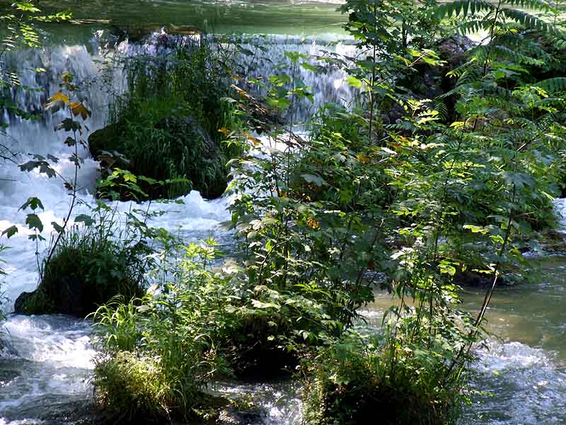
So no matter what you call green who could deny that the following greens (in our language) are reviving for the eye and soothe our soul?


(all photos ©Petra Voegtle)


Who would not love all these hues and shades of green??? Btw - the Easter bunny is already waiting...

~