Showing posts with label artificial colours. Show all posts

Sunday, February 27, 2011

What is Green?

I know - I am far behind my posts again. But I have some excuses. As I did not want to throw in just some meaningless words I need to find some time in between my other work to do some research and write about some things which might be of interest for you.


I want to continue with the series about the colour green. Let's go a bit into technical details i.e. into the rules of mixing colour and how the human vision works:

"Allegedly the physical world is achromatic. The human being can perceive light of various lengths between 400 and 700 nanometers as colours.Within the retina of the human eye there are colour sensitive photoreceptors in 3 different types. They are sensitive to 3 different wavelengths of the light, i.e. for short-wave, middle-wave and long-wave light. Short-wave light we see as blue, middle-wave light as green and long-wave light as red.

If the light is composed from two different wavelengths we will see cyan if the combination consists of short-wave and middle-wave light, yellow if we see a combination of middle-wave and long-wave light and magenta when the light is a mixture of long-wave and short-wave light. We will see white when all three wave-lengths are combined in equal parts and intensity. If no electromagnetic waves of the colour spectrum strikes the photoreceptors of the human eye (no light) we will see black.
This means the human eye has a maximum of 8 different extreme colour perceptions. They are the cornerstones and are therefore called the elementary colours."
(translated from http://www.ipsi.fraunhofer.de/~crueger/farbe/farb-wahr.html)
Red, yellow and blue make up the primary colours in a painter's colour wheel. This system, RYB is used in art and art related areas and was the prequel of the modern scientific colour theory.
But painters have always used more than the 3 primary colours and used green as the fourth primary although it is mixed from yellow and blue. Why is this so?

There are 2 major principles for mixing colours: additive mixing of colours and subtractive mixing of colours.When you use additive mixing you normally use light for mixing colours which are red, green and blue. When no colours are showing the result is black - when all colours are used the result would be white. Red and green create yellow, red and blue would turn into magenta. Additive mixing of colours is used in television and computer monitors.


The second principle of mixing colours is called subtractive mixing.
"Subtractive mixing is done by selectively removing certain colors, for instance with optical filters. The three primary colors in subtractive mixing are yellow, magenta, and cyan. In subtractive mixing of color, the absence of color is white and the presence of all three primary colors is black. In subtractive mixing of colors, the secondary colors are the same as the primary colors from additive mixing, and vice versa. Subtractive mixing is used to create a variety of colors when printing on paper by combining a small number of ink colors, and also when painting." (after Wikipedia)

Now comes the "paradox":
Additive colour mixing, f.e. red and green combined result in yellow, or blue, red and green making white seems to fight against the human common sense i.e. vision because anyone knows that if you mix yellow and blue paint you will receive a green paint! The reason for this is that the wavelengths of light that reach the eye are often selected through more intuitive subtractive processes: for example, cyan paint appears to our eye as cyan because it absorbs red wavelengths, and a yellow paint appears yellow because it absorbs blue wavelengths. But when white light falls on a combination of cyan and yellow, then, both red and blue are absorbed, and green is reflected to the eye. Complicated - isn't it?

One fact cannot be denied though: most painters include colours in their palettes which cannot be mixed from yellow, red, and blue paints, and thus do not fit within the RYB colour model. Really colourful greens, cyans, and magentas are impossible to mix, because red, yellow, and blue are not well-spaced around a perceptually uniform colour wheel (acc. to Wikipedia).

Let's look at some greens from the HTML chart codes and the appropriate names. These make clear that the naming of certain colours is really difficult and so is the determination if you don't have the codes available. The following colour fields also make clear that these colour shades and tints cannot be mixed as paints from yellow and blue paints in order to achieve the same values and brilliance. It is just not that simple.

If you look art the following image you will realize that actually "seagreen" appears much darker than the "dark seagreen". How can this happen other than being a mistake? I really don't know!


The following lighter shades of green do have a larger part of yellow - as you can easily see...


...while the second chart of the lighter versions of greens do contain more blues. Also here it seems hardly understandable why the value of the "light seagreen" seems to be higher than the "dark seagreen". Strange isn't it? The only explanation I have for this is that the eye perceives something different than a photometer does.


Here is another chart where you can see that there are some colours included in the "greens" that I personally would not count into this group but give them a separate grouping: the teals, aquas and turquoises.


Colours are an equally fascinating and difficult subject. Even if I work each day with colours as a painter I use them mostly in a very "emotional" way, hardly with the eye of a scientist. Nevertheless it helps a lot if you know at least some principles about colours in order to be able to find the right "material" for your own work, whether you are an artist, designer or work in any other colour related profession...

~


Sunday, January 02, 2011

Nature's Purple Feast - Blooms and Blossoms

After so many colour codes and colour wheels etc. I think it is time to concentrate on the natural purples you can find in blooms and blossoms...

Some examples for deep purple:


Examples for medium purple:


Here are some examples for the Munsell purple:


And here comes the royal purple:


Here is another example for the x11 purple:


And finally some examples for the tyrian purple:


(all photos ©Petra Voegtle)

Of course nearly every bloom of these examples contains various hues and shades of purple. This feast of colours is Mother Nature's treasure, which never ceases to be the largest well of inspirational colour creations...

~

Saturday, December 25, 2010

Purple - the Colour of Clergy, Kings and Witches

Do you love purple? I do - especially the dark shades of purple (which is here Tyrian Purple). But what is purple at all? Again not so easy if your consider all the hues that belong to the family of purples.

Purple - the colour - lies between red and blue. Depending on the quantity of pigments, its tints and shades, it either tends to the range of violets or the range of magentas and pinks.

In history the original purple was in fact Tyrian Purple, a colour which was extracted from sea snails. The first people who used this process were the ancient Phoenicians.
Tyrian purple was extremely expensive. Therefore it was no wonder that only the clergy and the royalty could afford to use this in their textiles. Additionally early sumptuary laws dictated and forbade the use of purple dyed textiles which became status symbols for anyone other than it was destined for. In Byzantium the production of shellfish purple was tightly controlled and even subsidized by the imperial court, which restricted its use for the colouring of silks for imperial use (after Wikipedia).

Recently, the archaeological discovery of substantial numbers of Murex shells on Crete suggests that the Minoans may have pioneered the extraction of Imperial purple centuries before the Phoenicians. Dating from collocated pottery suggests the dye may have been produced during the Middle Minoan period in the 20th–18th century BC (after Wikipedia).

Purple is associated with power, both earthly and spiritual. In healing, purple is used for mental disorders and also for becoming one with Spirit. In the aura purple signifies higher spiritual development. Purple is the color of the imagination. It can be creative and individual or immature and impractical. Following are some quotations about the psychological impact of purple:

"The color purple relates to the imagination and spirituality. It stimulates the imagination and inspires high ideals. It is an introspective color, allowing us to get in touch with our deeper thoughts."

"While the violet is not quite as intense as purple, its essence is similar. Generally the names are interchangeable and the meaning of the colors is similar. Both contain the energy and strength of red with the spirituality and integrity of blue. This is the union of body and soul creating a balance between our physical and our spiritual energies.
Purple or violet assists those who seek the meaning of life and spiritual fulfillment - it expands our awareness, connecting us to a higher consciousness. For this reason it is associated with transformation of the soul and the philosophers of the world are often attracted to it."

"In the meaning of colors, purple and violet represent the future, the imagination and dreams, while spiritually calming the emotions. They inspire and enhance psychic ability and spiritual enlightenment, while, at the same time, keeping us grounded."

"From a color psychology perspective, purple and violet promote harmony of the mind and the emotions, contributing to mental balance and stability, peace of mind, a link between the spiritual and the physical worlds, between thought and activity. Violet and purple support the practice of meditation."

"The color purple is specifically associated with royalty and the nobility, creating an impression of luxury, wealth and extravagance.
Purple has power. It has a richness and quality to it that demands respect. Purple is ambitious and self-assured, the leader.
Too much of the color purple can promote or aggravate depression in some. It is one color that should be used extremely carefully and in small amounts by those who are vulnerable to these depressed states."

"Positive sides include unusual and individual, creative and inventive, psychic and intuitive, humanitarian, selfless and unlimited, mystery, fantasy and the future.
Negative sides include immaturity, being impractical, cynical and aloof, pompous and arrogant, fraudulent and corrupt, delusions of grandeur and the social climber." (after http://www.empower-yourself-with-color-psychology.com/color-purple.html)
Here are the two basic colour blocks of purple - one dark, one lighter, different hues and values:


Another diagram of the purple range is this one:

(from Wikipedia)

You will realize that I excluded the lighter hues of this diagram in the above purple range because I feel that these belong to other hues and shades. DFA7E4 f.e. you would not call "purple" as standing alone colour - would you - but rather "plum".

(Btw - Munsell purple is named after the Munsell colour system. And the X11 purple comes from the first versions of Mosaic and Netscape Navigator which used the X11 colors as the basis for the Web colors list, as both were originally X applications - see Wikipedia).

 (from Wikimedia)

Here is a chart of the basic purples via http://www.toledo-bend.com/colorblind/purplechart.asp)

Basic Purples

Color Hex Decimal Co# Description
800080 128,0,128 1 Deep Purple
330033 51,0,51 2 Very dark purple
6633CC 102,51,204 3 Purple
663399 102,51,153 4 Purple
6600CC 102,0,204 5 Dark Purple-blue
660099 102,0,153 6 Royal Purple
9966CC 153,102,204 7 Lavender
9900FF 153,0,255 8 Periwinkle
FF00FF 255,0,255 9 Pink / Fuscia
9999CC 153,153,204 10 Purple-gray
CC99FF 204,153,255 11 Lilac
CC99CC 204,153,204 12 Light Plum
B030D8 176,48,216 Orchid

Interesting are also the psychological views on the variations of purple (the artificial ones - because there is a big difference between natural and artificial/HTML colours):

Variations of the Color Purple/VioletMauve:  Mauve helps us to make the best choices and decisions; it is concerned for justice to be done and always does the right thing. On the other hand it can indicate a degree of commonness, the social climber aspiring to higher ideals.
Lavender: Lavender is attracted to beautiful things. It has a fragility, sensitivity and vulnerability to it.
Lilac: Lilac (or light purple) implies immaturity, superficiality and youthfulness. It is extroverted and enthusiastic, inspiring glamour, romance and vanity.
Amethyst: A mystical color, amethyst opens intuitive channels. It protects the vulnerable and assists the humanitarian. It is the color of the evolved soul.
Plum: An old-fashioned color, plum is honorable and linked to family traditions. It is also prudish and narrow-minded, always preaching at you.
Dark Purple: Dark purple is related to higher spiritual attainment. A powerful color, it can also indicate arrogance and ruthlessness." (after http://www.empower-yourself-with-color-psychology.com/color-purple.html)

~

Friday, August 20, 2010

Colour Orange continued - the artificial Colour Codes

You think colours are a simple subject? Not so! You will see why...

When you have to determine colours it becomes quite complicated after a while. The difficulty starts when you have to identify a colour that comes from natural sources. Perception is often undefinable and depends on adjacent colours.

You would not believe how differential people react to a colour and how they would define it. What is still orange and what is already red, or still yellow? Also it is difficult to find pure colour in natural environments - but let's start with the "easier" ones: the colour codes of the electronic medium - the computer or rather the codes of the HTML language.

The colour range for the orange (in HTML definition) merely consists only of 3 colours - the 4rth does not belong (or rather supported by description) officially to the oranges as you can see from the name:


And here it starts already. Depending on your monitor and its settings these colours will appear differently on your computer.

It is in fact a different hue although at first glance it seems to belong to the same range! But you can check this by looking at your monitor from different angles. Now you see why the determination of a colour is so difficult.

Here is a nice chart of the Basic Oranges:

Basic Oranges

Color Hex Decimal Co# Description
  FF9933 255,153,51 1 Pumpkin
  CC6600 204,102,0 2 Sienna / Orange - brown
  663300 102,51,0 3 Dark Chocolate Brown
  FF6600 255,102,0 4 Orange
  996600 153,102,0 5 Golden Brown
  FF9900 255,153,0 6 Light Orange
  CC9900 204,153,0 7 Mustard seed
  CC6633 204,102,51 8 Brick / Red-brown
  FF7C80 255,124,128 9 Pink
  FF6633 255,102,51 10 Tomato soup
  FFCC66 255,204,102 11 Light mustard
  FFCC99 255,204,153 12 "Flesh"

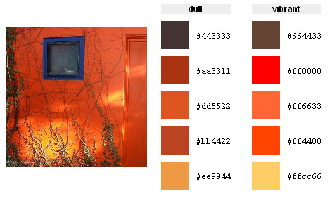
Now let us find the codes for the following images:


The colour codes are:
You will realize that - what we call orange - already has a different hue from the original pure HTML colour orange - clearly indicated by a different hex code.


In the image above we have 4 different hues of orange - indicated by hex code. The 5th colour, represented through #ee1100 apparently is no orange any more although one might identify this colour as an orange hue without knowing the hex code.

Would you have thought that the same orange hues are included in the images above?


You see - not a single image contains the pure colour code of orange - all images contain different hues of orange.


(all colour palettes have been created with the Color Palette Generator from DeGraeve.com)
~